You bought a banner ad on a stream. You tune in to check it out. But wait—where is it? You squint at the screen. Ah, there it is. Buried behind the streamer’s webcam border, or worse, covered by the League of Legends mini-map.
This is the "Invisible Ad" Syndrome.
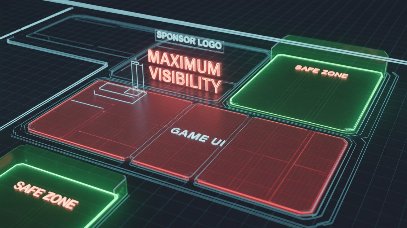
In 2026, screen real estate is precious. Between game UIs, alert boxes, chat overlays, and VTuber avatars, finding a clean spot for a sponsor logo is an art form. If you want ROI, you can't just slap a PNG anywhere. You need a strategy.
Here is the guide to optimizing OBS layouts for maximum brand impact.
1. The "Safe Zone" Rule (Know Your Game)
Every game has a different UI footprint.
-
FPS Games (Valorant, CS2): The bottom corners are usually taken by health and ammo. The top corners are often occupied by the radar or kill feed.
-
MOBA Games (LoL, Dota 2): The entire bottom third is a "No-Go Zone" (HUD and Map).
For Sponsors: Before approving a layout, ask the streamer: "Have you tested this overlay specifically with [Game Name]?"For Streamers: Create specific "Game Scenes" in OBS. Do not use a universal layout. A logo placed in the bottom-left might look great in Just Chatting, but it will be completely invisible in Dota 2.
2. The Dedicated "Sponsor Scene" (Intermission Layout)
This is the secret weapon of top-tier professionals. Instead of trying to squeeze a logo into a busy gameplay screen, create a Dedicated Intermission Scene.
When to use it:
-
Between matches (Queue time).
-
During the "Just Chatting" intro.
-
While reacting to videos.
The Layout:
-
Webcam: Large (40-50% of the screen).
-
Chat: Visible on the side.
-
Sponsor Slot: A premium, dedicated box (not just a floating logo) that says "Powered By [Brand]".
This layout signals to the audience: "We are taking a break from gaming to talk." Attention shifts from the gameplay to the streamer and the branding. This is the perfect time for a Shoutout (as discussed in our Ad Format guide).
3. The "Mobile Cut" (Vertical Visibility)
In 2026, over 60% of Twitch and Kick traffic is mobile. On mobile, the interface is different. Chat covers the right side of the video in portrait mode.
The Trap:If you place your sponsor logo on the far right edge of the screen, it might be covered by the chat overlay on the mobile app.
The Fix:Keep logos slightly centered or on the Left Side of the screen. This ensures visibility regardless of device or orientation.
4. Static vs. Rotating vs. Animated
The human eye ignores static objects after about 60 seconds. This is called "habituation." To fight this, use motion—but be careful.
-
Static PNG: Good for long-term presence, low distraction.
-
Rotating Carousel: Good if you have multiple sponsors. It keeps the spot "fresh" every time it changes.
-
Animated WebM: High attention, but high distraction.
Pro Tip: If you are paying for a premium spot, ask for a subtle animation (e.g., a "shine" effect) every 5 minutes. It re-draws the viewer's eye to the logo without being annoying.
Conclusion: Cleanliness = Professionalism
A cluttered stream looks like a NASCAR race car after a crash. A professional stream looks like a TV broadcast.
The best streams for marketing are Clean. They use whitespace effectively. They respect the game's UI. They ensure the sponsor is a partner in the visual experience, not an intruder.
Marketers: Don't just send a logo file. Send a "Placement Guide" requesting a Safe Zone check.Streamers: If you want to charge higher rates, audit your OBS scenes today.